January 20, 2026
The 6-Second Rule: How to Design Out-of-Home (OOH) Advertising That Actually Converts
By Ankur Mehra | Head of Marketplace at Moving Walls Market
The High-Speed Challenge
At Moving Walls Market, we often ask our clients to imagine their potential customer. They are driving down the highway at 65 mph, fighting traffic, listening to a podcast, and thinking about what to cook for dinner.
You do not have their undivided attention. You have a glance.
Designing for “conversion” in the physical world requires a radical shift in thinking away from web or print design. It’s about ruthless simplicity.
The Science Behind the “6-Second Rule”
Is six seconds really all you get? Actually, you might have even less.
According to the Out of Home Advertising Association of America (OAAA), the average viewing window for a billboard is between 3 and 7 seconds.
However, eye-tracking studies from the Virginia Tech Transportation Institute suggest that while a billboard is visible for longer, actual driver glances often last less than 2 seconds. This means you don’t just need to be readable, your words need to be able to capture in a glance.
This is a reality we emphasize to every client at Moving Walls Market: you don’t just need to be readable; you need to be instant. If your design takes ten seconds to comprehend, you haven’t just missed a conversion opportunity; you’ve wasted your budget.
The Core Rules of OOH Design (High-Speed)
To convert a moving audience with Out-of-Home (OOH) advertising, you must master constraint. The Moving Walls Market team recommends adhering to three non-negotiable rules:
- The 7-Word Limit: The most common mistake is treating an OOH placement like a giant flyer. Your headline must be the punchline. If you can’t say it in 7 words or less, you need to edit.
- High Contrast is Non-Negotiable: Subtlety is the enemy. Pastel colors will vanish against a grey sky. You need opposing colors: Black on Yellow, White on Red, Dark Blue on White.
- One “Hero” Image: A collage of images confuses the eye. Pick one powerful image that communicates the emotion of the result.
Visualizing the Rules: Good vs. Bad OOH Examples
It’s easy to say “keep it simple,” but harder to do. Here is how Moving Walls Market breaks down common business messages into high-converting OOH designs versus cluttered failures.
Example 1: The Local Dentist (Service)
The Goal: Get emergency patients.

- ❌ The Bad Version: The first example shows a classic mistake: trying to say everything. It’s cluttered, the text is too small, and it’s impossible to read from a moving car. (Why it fails: Too much text, tiny phone number, impossible URL to remember while driving.)
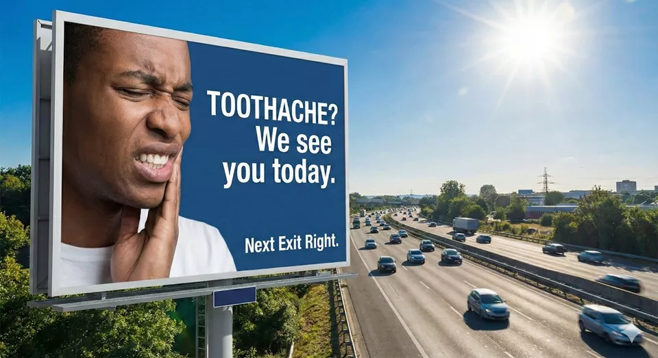
- ✅ The Converting Version: A striking image, a clear problem/solution headline, and an actionable CTA.
Example 2: The New Energy Drink (Product)
The Goal: Brand awareness and trial.
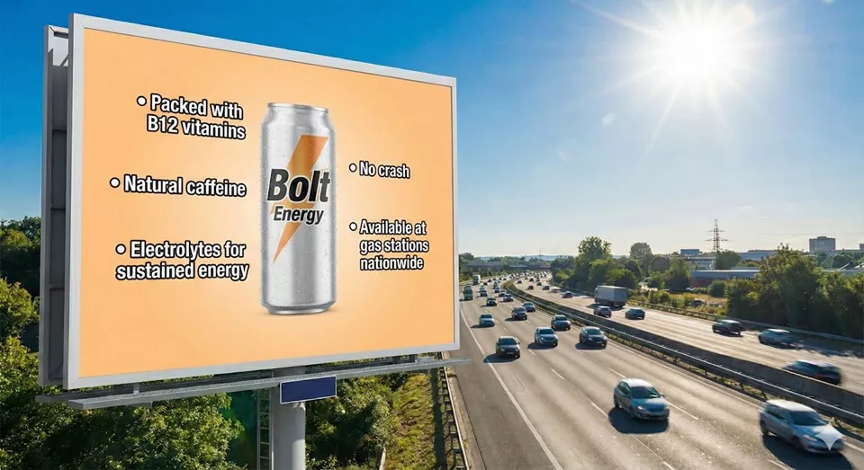
- ❌ The Bad Version: Cluttered with features that are impossible to read from a moving vehicle. This bad example focuses on product features (ingredients) rather than the benefit (energy). Nobody can read a bullet list at 80 km/h.
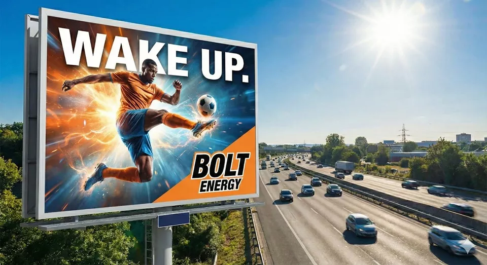
- ✅ The Converting Version: A powerful action shot and a simple, memorable command. The good version cuts through the noise by selling the result. It uses a dynamic, high-energy image and a two-word headline that says it all.
Example 3: The Real Estate Agent (Personal Brand)
The Goal: Get listings.
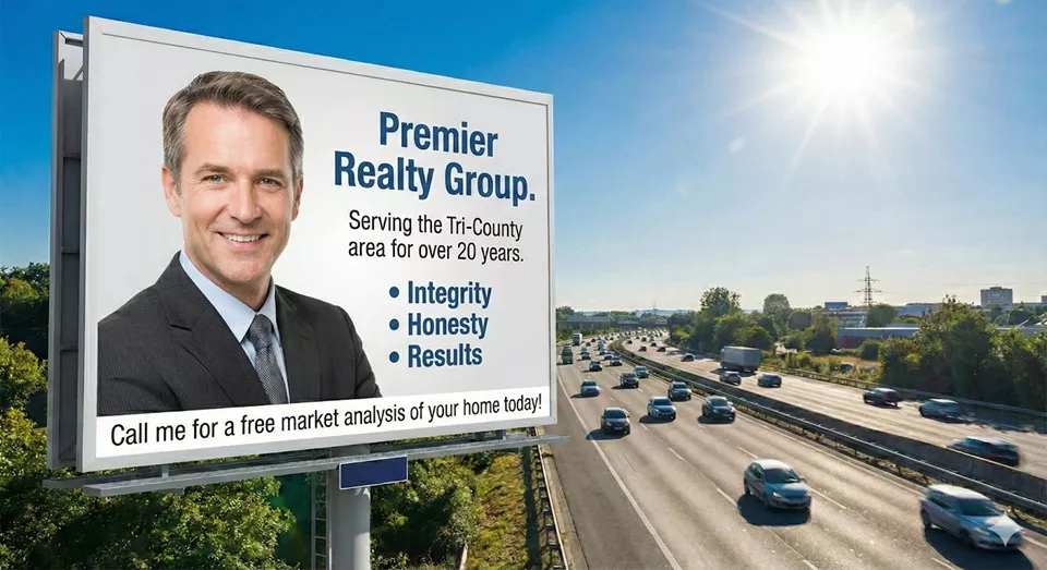
- ❌ The Bad Version: A generic headshot and vague buzzwords that don’t differentiate the agent. This billboard is a perfect example of “me-focused” advertising. It’s all about the agent’s years of service and generic buzzwords like “integrity.” It gives the viewer no reason to care.
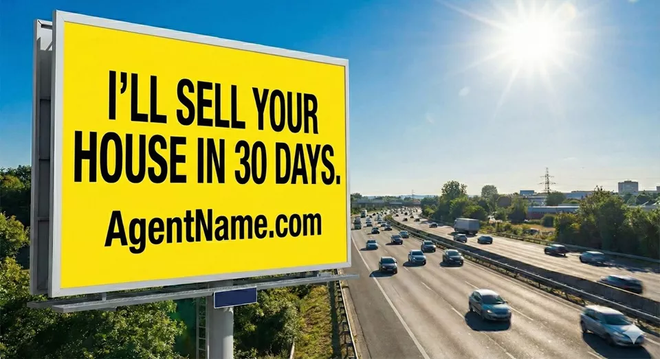
- ✅ The Converting Version: A bold, specific promise on a high-contrast background with a simple CTA. The high-converting version is all about the customer. It makes a bold, specific promise that addresses the number one concern of a home seller. The high-contrast yellow background ensures it’s unmissable.
The “Captive Audience” Exception: Indoor OOH Advertising
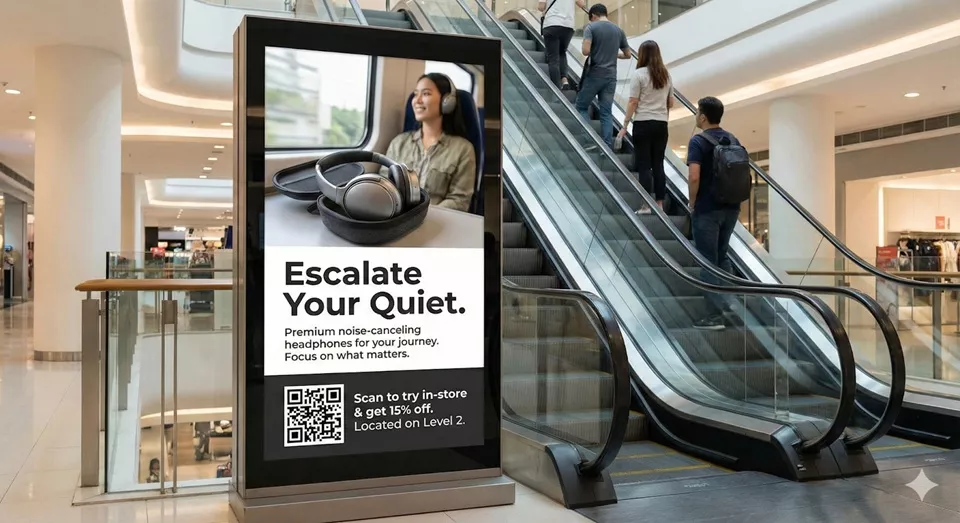
Not all Out-of-Home advertising happens at 80 Km/h.
When Moving Walls Market helps clients design for elevator screens, standing boards in front of escalators, or train station platform posters, the rules shift dramatically. This is a captive audience. They are bored, waiting, and looking for distraction. Their “dwell time” increases from 6 seconds up to 2 minutes.
Example 4: The Escalator Ad (Retail)
The Context: A shopper standing on an escalator for 30 seconds.
✅ The Converting Version: This format allows for more detail because the viewer is stationary. Notice how it still leads with a strong hook (“Tired?”), but then uses the “dwell time” to offer a scannable QR code and specific directions to the store.
How design changes for captive audiences:
- You Can Use More Copy (But Use Hierarchy): You can tell more of a story here. However, you still need a big, bold headline to grab their attention first. Once hooked, they will read smaller supporting text while they wait.
- The Return of the QR Code: QR codes are dangerous and often ineffective on highways. In an elevator or on a standing board? They are gold. People are standing still and likely already have their phones in their hands. This is the easiest path to digital conversion.
- Details Matter: On a highway, nobody sees fine textures. On an escalator panel right next to their face, high-resolution photography and intricate design details are appreciated and noticed.
The Indoor Mantra: Hook them quickly with the headline, then reward their dwell time with details and an easy digital connection.
Summary
Out-of-Home (OOH) advertising is a powerful tool, but it requires respecting the context of the viewer. Are they speeding past, or are they standing still?
At Moving Walls Market, we believe in keeping it loud, keeping it bright, and adjusting your complexity based on their speed.
Don’t Waste Your Budget on Bad Design
Ready to launch your campaign? Before you send your files to the publisher, run them through the Moving Walls Market Ultimate OOH Design Checklist. It ensures your ad is readable, trackable, and optimized for conversion.
Download the Free Checklist (PDF)

About the Author
Ankur Mehra is the Head of Marketplace at Moving Walls Market. He helps brands and agencies navigate the complex world of Out-of-Home advertising, ensuring every campaign is optimized for maximum visibility and ROI.
Scale up your OOH Ads with better ROAS today.